Next up in the Markup
Challenge is Aaron Swartz. Aaron is the
HWG's representative
on the RDF core working group! I could
never understand RDF, and have a great respect for those who can.
I must once again remind you that while you read this site review, you should bear in
mind that it is purposefully intensely pedantic. I'm coming from the view that complying
to the spirit of the specifications ("theoretical accessibility") is more important than what the
site is rendered in, in practice ("practical accessibility", if you will). This is not a
completely "ivory tower" position; as Web browsers improve, standards-compliant content
becomes more and more accessible and usable in different contexts, while non-compliant
content becomes less and less useful.
Also, Aaron, like Mark, volunteered for this and asked me to be as pedantic as
possible. So...
- .com
The first problem is a minor one given the state of our domain name space, but ".com" was supposed to be for companies, and this site is not a commercial site. Of course, I'm guilty of domain name polution myself, so maybe I shouldn't be so eager to raise this issue!
- Valid XHTML 1.0 DOCTYPE
A great start: the document validates to a Strict DTD.
- XHTML sent as
text/html
All my readers are painfully aware of my position on XHTML being sent
as text/html (or at least, that's the impression I get from all the
e-mails I receive with the disclaimer "Yes, I know my site is sent as
text/html, I'm so sorry, please don't shoot me, please"). So they would
probably expect me to complain loudly here about how Aaron is doing the wrong thing,
etc.
Well, no such luck. Aaron and I are currently in the midst of a
discussion regarding the pros and cons of XHTML-as-text/html, and so it
is possible that I may have my mind changed (as I did about application/xhtml+xml vs
text/xml). Therefore, while I wait to see how that unfolds, my opinions
on XHTML-as-text/html are on hold.
- Correct MIME types
The RSS feed and the stylesheets are correctly sent with the right MIME types.
Incidentally, as several people have pointed out to me, application/rss+xml
is technically not a valid MIME type. Neither is the almost ubiquitous
text/javascript. But if the standards communites are going to drag their feet
defining obvious MIME types, the world will continue without them, sadly. There is an
obsolete application/rss+xml
MIME type registration ID, does anyone know why
it didn't get moved to the standards track category (like text/xml) or to the
informational categary (like text/html)?
- No defined character set
The HTML files contain no encoding information, which means that a number of
conflicting specifications (notably HTTP, MIME, RFC2854, HTML 4.01, XHTML 1.0 and XML) enter the
game to try to determine which character set should be used to decode them, with the only
clear conclusion being "guess". Luckily, Aaron only uses codepoints that are a common
subset of US-ASCII, UTF-8, and ISO-8859-1, so the confusion doesn't cause any
ambiguities.
The CSS and RSS files similarly have no explicit encoding
information, but this is less of a problem. Only encodings that are a superset of
US-ASCII may be used with text/css so if the file only contains US-ASCII
characters the point is moot, and RSS files have well defined rules for determining the
character set (the application/rss+xml
specification points to section 3.2 of RFC 3023
which points to section 4.3.3 of the
XML specification).
- Setting colours without backgrounds
I had my default background colour set to a dark red (#BB0000, it makes a nice
background) so I didn't realise that there was a header on the pages — they are
coloured #b00, the same colour! My user stylesheet looked like this:
:root { background: #BB0000; color: white; }
:link { color: yellow; background: transparent; }
:visited { color: orange; background: transparent; }
This stylesheet also made it very hard read to read the lines giving the dates of when
the articles were posted.
While I applaud the idea of leaving most of the colours to user, you have to be
careful to always give colours and backgrounds together, so as to avoid this kind of
clash. (When setting a colour to transparent, make sure to then set all colours, so as to
prevent further clashes.)
<div id="banner">As with Mark's <div id="logo">, this element appears to be
there purely for stylistic reasons and doesn't seem to add anything to the structore of
the document. As such, it should be removed.
The contents of the element are in
the form "title" "subtitle", which isn't very well handled by XHTML1, unfortunately. A
better solution would be either to use both <h1> and
<h2> in series, or, preferably in my opinion, to use a single
<h1> with the important part emphasised with an
<em> element or some such. This problem was recently discussed in
www-html, hopefully the HTML WG will notice and give us a subheading element, or at
least explicitly state how to mark up subheadings. This is a problem I often
hit.
<div class="content"><div id="main">At least one of those <div>s is redundant, if not both.
<h2 class="title">That's a tautology: the class isn't adding anything.
alt="H4X0r ECONOMIST: make economy"That alternate text is more like a title than alternate text. A much better
alternate text would be "H4X0R ECONOMIST. lol GPL wh4Tev3r make economy. Alan
Greenspan scowls. The Supreme Court finds that, owing to GPL compliance issues raised in
the case Free Software Federation v. Greenspan, our nation must henceforth be known as
the United Nations of GNUmerica. William Rhenquist has a serious expression. One week
later: Richard Stallman is happy: YES", which conveys roughly the same as the
comic. A longdesc to a description of the comic's typography and layout
would be useful too.
<table class="invisible">While I think a table is actually a not unreasonable element to use for the
semantics here (two paragraphs being compared), the class is. "invisible" is quite
clearly a presentational semantic. A better class would have been "comparative alegory",
for example.
<div class="img"><img
 src="http://www.aaronsw.com/2002/gelernterNov7-1" alt="A file cabinet being thrown out
 the window" /><br />Jon Keegan, New York Times</div>
Here we see several problems back to back. First, why a <div>?
This is a paragraph, not a section. Secondly, the poor alternate text. The image is
purely decorative as far as I can tell: if I was reading this story to someone, the image
would not convey any additional information. Appropriate alternate text is therefore
probably "". Next, the <br> element. There is nothing inherent about
that paragraph that semantically requires a line break: that the image and the text
appear on different lines is purely presentational. Finally, the caption, which I presume
is a citation, should be marked up using a <cite> element.
class="calendarhead"That class is redundant, given that the calendar has an ID.
- Lists that don't use list markup
There's a list of entries in the "Archives" section of the menu sidebar, but it is
delimited by <br> elements instead of using one of HTML's list
elements. This same problem is repeated in several places, e.g. "Feeds I Read".
- More presentational
<br>
In the "What I'm Doing" section there are some very blatent cases of
<br>s that have absolutely no semantic purpose. Most should be
removed, or turned into paragraphs or lists.
alt="spread the dot" ... spread the dotThe image doesn't seem to actually be conveying anything, certainly not "spread
the dot" since that text is immediately repeated after the dot. Maybe alt=""
would be better?
<div class="footer"> <address>According to Dan Connolly, the
<address> element is a general footer element (unfortunately I can't
find a reference to the e-mail thread in which we discussed this; maybe I am
misremebering what he said), so that would make the <div> element here
redundant. Unfortunately the HTML4 and XHTML2 specifications don't really back that up,
so maybe a footer <div> is best. In any case, the copyright notice in
the footer should be in a paragraph.
The main errors I would be concerned about are the inappropriate
<br> and poor alternate texts, as they will be affecting accessibility
today, but the other errors are not that minor either. I liked the stylesheets in general,
as they tried to give the users the final word on most issues. The lengths are given in
relative units, which is always good.
Overall, not quite as good an effort as Mark's, but still respectable.
I look forward to seeing whether Aaron fixes all the errors as Mark did!
The next site I'll be examining is Mike
Shaver's Web log. I don't know how many more of these I'm going to do, it depends
largely on how long I can keep doing them without either getting bored or before I run out
of new errors (not much point reporting the same errors over and over again). Thanks, by
the way, to all the kind people who have been picking my own site to pieces by e-mail...
I'm glad to say that don't think there are any outstanding issues.
2002-11-21 20:27 UTC
Tag Soup: How UAs handle <x> <y> </x> </y>
HTML user agents have to be able to cope with invalid markup, such as unclosed tags, tags closing in the
wrong order, and tags where they aren't allowed, if they are to render the existing Web. Rendering the existing
Web is rather critical, because if you fail to do so, no user will adopt you. (A Web browser that can only load
Dive Into Mark and the W3C site
isn't much good to anyone.)
Unfortunately, the HTML specification does not define how to handle invalid markup. (XHTML does, because it
uses XML, which goes to great lengths to define how to handle invalid markup. This is one of the best features
of XHTML as far as most Web weenies are concerned — it forces pages to be syntactically correct!) Because
it is undefined, Web browsers have each had to invent their own way of handling invalid content, while all
trying to get the effects that are similar enough that users will think all is fine.
Let's take an example of invalid markup:
 <body>
  <p>This is a sample test document.</p>
  a <em> b <address> c </em> d </address> e
 </body>
How would you represent this in the DOM? This is not a trivial question. The DOM was designed to cope with
well-formed documents, it has no facility for coping with elements that are half in another and half out of it.
(And nor should it — after all, such documents are invalid.)
WinIE 6 tries to faithfully represent what the author wrote, to the point of making the
DOM itself ill-formed, as described below. (Note that whitespace nodes and the text node child of the P
element have been ignored for simplicity.)
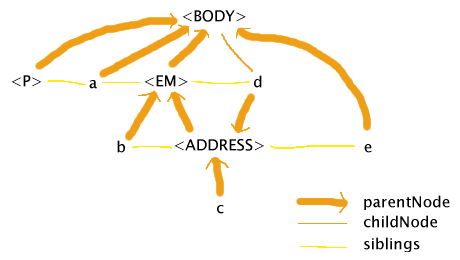
This DOM quite close to what the author wrote — e is indeed a sibling of the ADDRESS element while
being a child of the BODY element, and d is indeed a sibling of the EM element while being a child of the
ADDRESS element. That d is a child of the BODY is, I think, an artifact of IE trying to get the second half of
the ADDRESS element to be under the BODY while the first half is under the EM.
This DOM is probably showing us a lot more about the internals of Trident (WinIE's layout engine) than was
intended. An implementation that internally uses a tree (which is basically what you need to correctly do CSS2)
would be hard pressed to come up with a DOM like this.
Mozilla 1.2, on the other hand, tries to get the same effect, but without deviating from
the rules of the DOM, namely that it has to be a tree:
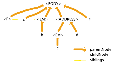
The main feature of this treatement is that it has two EM nodes. Mozilla reaches the ADDRESS start tag and
realises that EM elements cannot contain ADDRESS elements, so it closes the EM and reopens it inside the
ADDRESS. Except in certain edge cases (like borders, explicit inheritance, and which selectors match which
elements), the result of styling using CSS would be the same as in IE.
Opera 7 Beta has yet another interpretation. It attempts a mixture of the Mozilla and IE
attempts: it tries to keep the DOM valid while not letting any of the elements in the document map to more than
one node in the DOM:
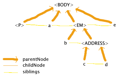
The basic principle at work here, it appears, is that the markup is fixed up by delaying any closing tags
until after all other open elements have been closed, and no attempt is made to make the DOM follow the HTML
DTD. So in this case, the ADDRESS element keeps the EM element open until its end tag. Opera's DOM is not the
full story, though, as even though Opera puts the two text nodes (c and d) under the same element in the DOM,
it still styles only the first text node (c) as if it was in the EM. (To some extent. It appears that
some styles are propagated, and not others.)
The advantage of the techniques used by IE and Opera is that it makes it easier to cope with styling and
scripting invalid markup. If you use the DOM to dynamically alter the EM element in IE's case, for instance,
it'll happily affect the element throughout, around both b and c. In Mozilla's case, an attempt to change the
EM element would only affect one of the parts at a time, so for example adding a border around the first EM
would not put a border around text node c. Opera achieves the one-to-one mapping of markup to element as well,
but doesn't restrict the EM to the text nodes that it contains in the markup.
The approaches used by Mozilla and Opera, though, get you a much more stable DOM. This is important for
scripting: if you try to walk IE's DOM, you are likely to hit an infinite loop, because walking up the chain of
parents for d (namely d → ADDRESS → EM) and then going to the next sibling will bring you straight
back to d.
Mozilla's candid nature (what you see in the DOM is exactly what it's going to style) makes
interpreting its results a lot easier. Opera's approach (providing a DOM but styling a slightly different
model) is a lot more confusing.
The net result is that each model has its advantages and disadvantages, and they are about equally matched.
And since HTML leaves this undefined, all of them are correct.
If you are interested in examining this further, I based this article on the results I obtained using a client side DOM browser I wrote
and my legacy HTML parsing test 004
(which is not really a test, since there's no "correct behaviour"). That test also throws styling into the mix
(I touched on this above). Amusingly, if you compare Mozilla's behaviour on tests 004 and
005 you find an obscure bug that has nothing to do with the
markup being invalid (the colour changes even though the only difference is that 'font-variant' has been
changed to 'font-weight').
Pingbacks:
1
2
3
4
5
6
7
8
9
10
11
12
13
14
15
16
17
18
19
20
21
22
23
24
25
26
27
The distinguished Mark Pilgrim was the first
to come forward as possibly
having a perfect Web log, although he admitted to having a few known issues.
While you read this site review, bear in mind that it is purposefully intensely
pedantic. As my own site demonstrates, I'm coming from
the view that complying to the spirit of the specs to be a lot more important than
what
a page may look like in famously broken
browsers like Windows IE 6 and earlier.
Enough of the disclaimers, though. On with the review:
- XHTML
The whole document validates
as XHTML 1.0 Strict, which is a cool.
text/htmlOf course, I have to mention the
fact that Mark is sending his XHTML page as text/html. Why not send it as text/html to
IE, and application/xhtml+xml to everything else? This is roughly what Xiven does,
for instance.
- More MIME types
The main page is not the only page sent with the wrong MIME type, unfortunately.
The FOAF file is sent as text/plain,
while it should be some XML variant. This is especially noticable because the <link>
element pointing to that file claims its MIME type is application/rdf+xml.
Similarly,
the <link> element pointing to the RSS feed says its MIME type is application/rss+xml
but it is actually the controversial text/xml. (Which causes another problem — what is the character set of the RSS feed?
Per RFC3023 (section 3.1, paragraph 3) it's US-ASCII but
per the XML declaration in the file, it's UTF-8. Thankfully in this case it doesn't really matter since
all the codepoints in the file are common to both encodings.)
While we're on the subject, I'll just
quickly add that the MIME type of the JS file (text/x-javascript) doesn't match the MIME type
used in its <script> element (text/javascript) either.
<div id="logo">This element appears to be there purely for stylistic reasons — it doesn't add anything to the structore of the
document. As such, it should be removed.
Actually, <div>s are a pain. At the moment
(i.e. in the pre-XHTML2 world), they are basically serving two roles: section delimiters (the <section> element
in XHTML2) and presentational hooks for CSS (the <div> and
<span> elements in XHTML2).
Section delimiting is fine, but adding hooks for presentation into a supposedly semanticly marked-up document is
very dubious. Unfortunately, CSS2 has very limited abilities for adding stylistic hooks to content (the :before,
:after, :first-letter and :first-line pseudo-elements are about it) and the
technically correct solution (using XSLT to add the hooks on the client side) is a pain.
My rule for whether a <div> is semantic (delimits a section) or presentational (only there
to be used from CSS) is pretty simple. Does the block start with a header and then have content? Or, if not, would the block still
make sense if you added a header to it? If the answer to either question is "Yes" then the <div> is legitimate,
otherwise you should look for ways around it.
In this case, the <div> is definitely presentational, since all it contains is the page header (which
is correctly marked up using an <h1>).
<span id="logoleft">Well, in theory, <span>s with just a class or id are as bad as <div>s. However,
I don't see any way around it, and indeed I use <span>s myself for exactly the same reason, so nevermind!
<span class="divider"> </span>Mark assures me that this is to get around a bug in Bobby,
a tool used to detect accessibility problems on a site. This is silly! You should not make your page less compliant to the
accessibility guidelines just in order to appease a buggy tool.
In fact, several of the uses of <span class="divider"> </span> on Mark's site actually
make the page harder to read using Lynx and other non-CSS browsers.
I would recommend removing them all and complaining to the Bobby team.
<a class="skip" href="#startnavigation">Jump to navigation</a>This needs to be marked up as a paragraph. If it wasn't for the <div>,
which as mentioned above really should be removed, this would be invalid. Other than that, though,
this is a great aid to accessibility. For instance when browsing this site with Linx it makes
finding your way around the site a lot easier.
<div id="wrapper">, <div id="main">These are redundant. A case could be argued for keeping one of them (it's the main content "section")
but there is no doubt that at least one of them should be removed, since they exactly shadow each other.
The name of the outer one's id is a giveaway too.
- Redundant titles
This is a very minor nit, but I noticed that the permalinks have titles set on both the link, and the link
label (an image). Since the image itself is not the permalink, I would suggest removing its title attribute.
The alternate text is well chosen, however, conveying exactly the same as the image. Indeed, I'd say the
image is harder to understand than its alternate text! (I had to examine the square box to get its tooltip before
I realised what it was for.)
<p class="firstparagraph">That class attribute doesn't add anything, especially now that CSS has a
:first-of-type selector.
<cite>dive into mark</cite>Fine use of an often misunderstood element.
’Good use of U+2019, the preferred character to use for apostrophe
.
<p></p>Empty paragraphs are disliked by the HTML specification.
This is almost certainly caused by an over-zealous CMS, in which case
it is a good example of why CMS systems have to be very carefully designed, and are not simply an alternative to writing accessible
markup!
<p class="categories"> This non-breaking space is extraneous, and doesn't add anything valuable to the content (what does a word consisting of just a space on its own
mean?). It's not entirely clear to me why the space is needed here, so I presume it is to work around some obscure browser bug.
Note that in this case, the single link is in a paragraph of its own, as I suggested the "Jump to navigation" link should be.
This is good.
<span class="divider">[twisty.com] </span>Normally I wouldn't even mention something like this, but I'm pretty sure it's not what was intended, and I wasn't really sure
what was. The problem here, basically, is that I don't think the class is correct. How is the domain a divider? One could also argue
that the content of the span is redundant, since it's information that is already stored in the link.
There are some other cases of strange use of the "divider" class in the menu section.
<div class="center"><div class="hr" title="Lorem ipsum is a harsh mistress"><hr /></div></div>Wow! This is probably the worst line of the entire page. First, class="center" is presentational markup in disguise. The class should be made semantic ("divider" might actually
be correct in this case). Second, the inner <div> is redundant (like the wrapper/main <div>s above).
Third, the class of the inner <div> is redundant, since it is just a repeat of its contents. Fourth, the <hr>:
Since this page is marked up using <div>s as section markers, it makes little sense to also use <hr>s.
I'd recommend removing the entire line, and using <div>s to mark up the days instead.
<a name="startnavigation" id="startnavigation"></a>This appears to be redundant with the previous non-blank line, which also sets an id. If it's important
to stick with <a name=""> markup, then it should preferably be wrapped around the header on the next non-blank
line (think about what the element, as written, means: the start of the navigation is an empty string).
Overall, this is a very well designed site, with most of the problems appearing to be conscious decisions to work around bugs in
software, rather than mistakes. The stylesheets are very well written, with pixels only used in the very few legitimate cases,
ems and percentages being used elsewhere, colours and backgrounds specified together, and so forth. The markup is
semantically rich, presentational markup is avoided except in a few cases, and many accessibility features are well used.
This site will probably not be the most valid, semantically rich, no-presentational-markup, strictly compliant Web log
of this challenge, but it is definitely a top contender.
The next site I'll be examining is Aaron Swartz's Web log.
Pingbacks:
1
2
3
4